
- Home
- Pitch Analyzer
- Instructions
- History
- Instructions
- Notation Viewer
- SourceForge project page
Pitch Analyzer Instructions
The screen shot below shows the main sections of the Pitch Analyzer: title, menu bar, button bar, data area, and status line. There are also keyboard short cuts for zooming, browsing, and playing.Here is an example file you can use in order to get acquainted with the Pitch Analyzer: m.wav.

- The title
- The title bar shows the name of the analyzer module
and the name of the audio file.
- The menu bar
- The button bar
- The meaning of the buttons are the following:

Zoom in either by the factor two or into the selected interval in yellow. 
Zoom out by the factor two. 
Show the complete data. 
Play the visible interval. If there is a selected interval (marked in yellow) only the selection is played. 
Stop playing. 
Stop loading audio data. - The data area
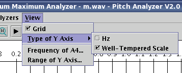
- Here the sound data (light gray) and the pitch (in various colors) is shown. The x-axis denotes the time (in seconds) whereas the y-axis denotes the pitch. The y-axis is a logarithmic axis when its scale is given by the notes of the well-tempared scale. The pitch can also by shown in Hz.
Moving the mouse inside the plot shows the actual cursor position by a vertical line with a violet box showing the time position. Furthermore, pitch information is shown in a green box.
You can mark an interval by pressing the mouse button and dragging the mouse. The marked interval will be shown in yellow. Also its length is given in a red box.
The color of the curve codes the quality of analysis (also shown in the green info box). The meaning of the quality depends on the actual analyzer chosen.
- Minimum Maximum Analyzer:
-
Color Quality Meaning magenta min The pitch has been calculated based on local minima of the signal. blue max The pitch has been calculated based on local maxima of the signal. gray no signal The signal amplitude was to small (i.e. less than the threshold defined in the Options dialog). orange last No pitch could be detected, instead the last successfully measured pitch is shown. red no success The pitch couldn't be detected, and the last points where also not successful.
- Frequency Peaks Analyzer:
-
Color Quality Meaning red first This is the pitch which is probably the most dominate one. green rest All other pitches or frequencies which might also be present in the signal.
- The status line
- On the left general information of the audio file is shown. The right part shows task information and a progress bar during file loading and pitch calculation.
- Keyboard short cuts
- The keyboard short cuts are for navigating and playing audio data.
- Cursor up
- Zoom in by the factor two or into the marked area.
- Cursor down
- Zoom out by the factor two.
- Cursor left
- Move the data window to the left.
- Cursor right
- Move the data window to the right.
- Home
- Zoom out to full view.
- P
- Play audio data. If an interval is selected only this interval is played otherwise the visible data window.
- S
- Stop playing.
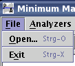 This menu is for loading an audio file and
exiting the application.
This menu is for loading an audio file and
exiting the application.
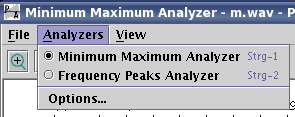 This menu is for selecting an analyzer
and changing the parameters of a the currently
selected analyzer (menu item Options...).
This menu is for selecting an analyzer
and changing the parameters of a the currently
selected analyzer (menu item Options...).
(C) 1994-2015 Franz-Josef Elmer All rights reserved. Last modified: 8/2/2015